Guest post by Margaret Copeley, MEd
Many people must spend virtually their entire work day at a computer. In addition, many of us spend several more hours using a computer for personal activities: email, shopping, researching topics of interest, and so on. As a freelance writer and editor I found that Computer Vision Syndrome crept up on me over a period of a couple of years after about ten years of very intensive computer use. My eyes were very dry and burning; my vision was blurry; I had constant headaches; I became very sensitive to light both indoors and outdoors. My discomfort and poor vision became so severe that I really wondered if I could continue in my work. That was a sobering thought, and it motivated me to learn as much as I could about my eyesight and how it is affected by a computer.
In this article I will describe some strategies that can make a significant difference in eye comfort for writers, editors, and others who work mostly on a computer with an emphasis on customizing Microsoft Word for maximum clarity and comfort.
Contents:
1st Principle: Consider ALL contributing factors to eye health and comfort
Microsoft Word: The bane of writers, readers, and editors
The best word processing page color
Changing your computer and your environment is not enough
1st Principle: Consider ALL Contributing Factors to Eye Health and Comfort
Computer Vision Syndrome, in my experience, is an accumulation of several factors that build up and finally overwhelm your eyes. A partial list includes:
- Eye health
- Degree of myopia
- Glasses prescription (accuracy)
- Type of lenses in your glasses (single vision, bifocals, progressives)
- Workspace lighting (type, placement, intensity, natural or artificial, windows, shades)
- Placement of your chair and desk in relation to windows and lighting
- Work habits: eye movement; body movement; hours per day at the computer
- Screen glare and reflections off other computer surfaces
- Nutrition
- How you spend your nonwork time (electronic devices, television, indoors or outdoors, reading, etc.)
- Computer setup: backlighting; Windows colors, fonts, and font sizes
- Word processor setup: colors, fonts, font sizes
Many of those factors are covered in detail on this website. Here I will focus on the last two and how you can adjust your operating system and word processor for optimum eye comfort. I mention the degree of your myopia (nearsightedness) on the above list because people who are very nearsighted (a prescription of -6.00 or higher) have a higher risk of photosensitivity as well as several degenerative eye problems, including cataracts, glaucoma, retinal detachment, and macular degeneration [Myopia and Associated Pathological Complications (2005); Treatment Options for Myopia (2009)]. If you have high myopia, it’s important to have a yearly eye exam to update your prescription and monitor the progression of problems like floaters (dark or wispy shapes that float across your field of vision).
My experience has been that very intensive computer use worsens these problems, indicating the importance of controlling every factor you possibly can to preserve your vision. There is much more at stake than comfort and being able to do your job. You only have one set of eyes and some eye problems are not treatable, such as macular degeneration.
Microsoft Word: The Bane of Writers, Readers, and Editors
If you have light sensitivity or Computer Vision Syndrome, opening Microsoft Word can feel like you’re being interrogated under thousand-watt lights. By the end of the work day you want to tear your eyeballs out. With both Windows and Word, it seems that Microsoft designers have given very little thought to eye health and user comfort with their very bright interfaces that assault the eyes.
For the best possible clarity and eye comfort with word processing, you need to adjust seven things:
- Page color
- Font
- Font size
- Main text color
- Color of tracked changes
- Blue light
- Screen brightness
Your MS Word color scheme consists of the page, text, and Track Changes colors. In addition, your visual comfort will be impacted by the color of the Windows menu bar and the taskbar as well as the font and font size that you’ve selected for the Word toolbars.
A basic principle for writers and editors is that whatever colors, fonts, and other features you choose, they need to be unobtrusive and nondistracting so you can focus on the text and not the appearance of the page. The goal of the recommendations below is to give you a page with a soothing appearance that is easy on the eyes and psychologically neutral. You can experiment with these suggestions until you find what works for you personally.
Page Color
Page color is the most important thing you can change to improve your eye comfort. MS Word confronts you with a glaring white page. Depending on your version of Word, the top banner or toolbars may also be white. Within the Word interface there are limited options to change the page color. The options in the past were white, gray, and blue. Blue or white may be the least desirable background colors choice because blue and white digital screens emit the highest intensity blue light. (See Least Likely Colors to Cause Computer Eye Strain.) Word 2016 offers a new high-contrast dark gray theme. Gray is better than white, but I think there are better colors.
Instructions for changing background and page colors need to be somewhat general because the menus are different in each version of Word. (There have been 15 versions of MS Word for Windows and 13 versions for Macintosh since 1985.)
It’s possible to quickly change the color of the page but not the surrounding borders by selecting the entire page (control + A) and going to Formatting and then Borders and Shading. The shading tab will offer you 64 standard colors to choose from. If none of those suit you, choose a color that’s close to what you want and go to “More colors,” where you will be able to create any color you like by adjusting the amount of red, blue, and green.
Adjusting the color in this way is easy but less desirable for five reasons:
- It leaves a glaring white border around the page.
- You have to change the color for each document.
- If you send the document to other people, it will open up in your chosen color, which they may not like.
- When you receive documents from others they will have a white background and you will need to change it to your preferred color.
- When you paste things from the internet into a document they will have a white background.
The way around all of those problems is to change the colors of your Window’s theme, which will also apply to MS Word. With this method all of your documents will open up in the same color, no matter where they come from, and pasted text will have the same color background. MS Word will be one uniform color with no white background. Documents that you send to others will show up in white on their end, which is how most people expect to view them. An additional benefit of changing the theme is that the color you choose will appear across your platform: in your email, menus, and so on.
Changing the Windows theme takes some practice and patience to get the colors just right. Some things might change unexpectably if you’ve previously made other changes to your display settings, like scaling the size of fonts and icons. Some of these problems can be resolved by restarting your computer after you change the theme.
If you use f.lux to reduce blue light, be aware that it will change the appearance of colors.
See these instructions for changing theme colors in Windows 7 and Windows 10. To change the theme in Windows 8.1 follow these steps:
- Right click on the desktop and go to Personalize.
- Before you make any changes, note what your current theme is so you can return to it if needed.
- Select any of the high-contrast themes. Don’t be shocked when the colors change drastically. This is only your starting point. You will be able to change all of the colors to your liking. You must start with a high-contrast theme in order to fine-tune the colors.
- Press the windows key + R to open the Run command window. Type “control color” and click OK.
- Click “Show color mixer.”
- There are three columns on this menu. The left column shows the components that you can change the colors for: window background, hyperlinks, disabled text, and so on. The middle column shows the foreground color and the right column shows the background color. “Foreground” means the text and “background” means the color behind the text. “Button” refers to the color of the taskbar and the window borders.
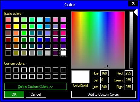
- First click on the middle column of the item you want to change. Start with the Windows background. The color mixer will pop up. If you like one of the standard colors, select it and click “OK.” To see how it will appear on your screen click “Apply.”
- You can also create your own colors. In the color mixer box you can change the color by entering RGB (red, green, blue) formulas, by moving the cursor around the box, or moving the slider on the right side. To get ideas for colors and their RBG formulas see the Adobe color wheel and Adobe color themes. When you have the right color, click “Add to custom colors,” select the small box that shows the color, and then click “OK.”
- Your color selection will now appear in the left column. Do the same for the background color in the right column. If the result isn’t quite what you wanted, change the colors as many times as you like until you get them right.
- Set the color of your desktop. Right click on the desktop and choose “Personalize.” Click on “desktop background.” You can choose an existing color, create a new one, or use a photo.
- When you’re satisfied with all of your changes, save your theme. It will appear as “Unsaved theme” on the Personalization screen. Give it a name and click “Save.”
The Best Word Processing Page Color
We can probably agree that certain background page colors wouldn’t work well for extensive word processing, including yellow, orange, fuchsia, and other intense and distracting colors. The ideal is a subtle color (so you can focus on your work) that is soothing to the eyes and psychologically acceptable and that doesn’t have an overwhelming amount of blue in it. (Read this article to understand the impact of blue light.) Your color scheme also needs to provide sufficient but not excessive contrast between the text and the page. I tried many of the 64 standard colors in MS Word (below) and didn’t like any of them.
Some were close to what I felt comfortable with but not perfect. You will get the best result by starting with a standard color and then fine tuning the combination of red, green, and blue. Remember, you can change the page color through the word processor but it’s preferable to change it in the Windows theme.
I’ve tried several different shades of gray, light blue, black, and green. All of those were better than a white background, but not just right. Ultimately I found that a light tan color best meets all of the above criteria, specifically the combination of red 188, green 175, and blue 146. Here is a screen shot of that color:

In the screen shot you can see that I’ve set the Windows taskbar and title bar to a forest green (R 100, G 165, B 138) to provide a harmonious contrast with the MS Word page and to avoid a psychologically drab screen.
If you reduce the size of the page you will find that the background is gray:
If you increase the size so that the colored part takes up most of the screen width you may find that the 12-point Arial font is just about right for comfortable reading. If you prefer a smaller MS Word window (perhaps you have mild or no myopia), you may find that the gray background is comfortable. Most importantly, there is no glaring white shouting at you with this color scheme.
Color choice is entirely personal, but I can say that this tan color alone improved my eye comfort by 100%. Experiment with several different colors until you find the right one.
Font
Which font is most readable has been studied fairly extensively, in part because readable words make money for advertisers and publishers. Legibility refers to the recognizability of individual letters while readability refers to the ease of reading blocks of text. The debate on readability centers on which is better, serif or sans serif fonts. Here’s the difference:

Serifs are the small embellishments on the tips of the letters. A sans serif font is quite plain by comparison. Fonts have an emotional impact on us (many people experience serif fonts as friendlier and sans serif fonts as colder), but our concern here is eye comfort. Books are generally printed in a serif font, but in years past the limitations of computer screen resolution made for fuzzy serifs, leading to a preference for sans serif fonts for websites. However, higher screen resolutions in recent years have weakened that argument for sans serif fonts. Despite the claims of fervent fans of one font or another, user-experience consultant Alex Poole reviewed 50 studies of font readability and found very little evidence for better readability of either serif or sans serif fonts.
But for people suffering from Computer Vision Syndrome who read text all day, I believe there are differences among fonts that can either worsen or improve eye strain. Compare the following samples in Times New Roman, Arial, and Verdana, all in 12 points.
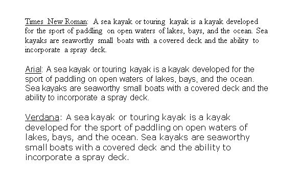
The size difference among these three fonts illustrates that point size is not a definitive measurement—it refers to the size of the metal block that letters are formed on, not the size of the letter itself. In the above sample, Times New Roman is smaller and generally weaker than the other two fonts. Arial and Verdana are heavier and have noticeably more contrast. Verdana is larger and more stretched out than Arial. If you increase Times New Roman to 14 points to be closer to the size of 12-point Arial and Verdana, you can see that Times New Roman is still thinner and has less contrast:

The difference in weight and contrast is because Times New Roman letters have thin and thick parts while Arial and Verdana have a more uniform thickness throughout the letter:

Arial may be the least interesting of the three fonts, but we’re looking for readability, not interest. To my eye Times New Roman loses the readability test compared to Arial and Verdana.
There are many other fonts you can experiment with. I used Times New Roman for 20 years before I finally tried Arial. I quickly concluded that Arial on a tan background is many times easier on the eyes than Times New Roman on a white background. Experiment with different fonts and see which one works best for you against your chosen background color and with your preferred text size. Your eyes will thank you for giving something other than Times New Roman on a white background a chance.
Font Size
Obviously you can simply magnify the page to increase the size of words to a comfortable level, but reading comfort also depends on the number of words per line. Most people are comfortable reading 12-point type. Those who have strong myopia corrected by glasses see the world smaller than people with normal vision. If you have strong corrective lenses for myopia you may find 14 points more comfortable for printed documents. I write and edit documents on a computer in 12-point Arial because that gives me a comfortable number of words per line but I change the document to 14-point Times New Roman if I need to print it. (Proofreading is more accurate on hard copy, both because paper reflects less light overall and less blue light than a screen emits and because you can use a pen or pencil to help your eyes track across the page.)
Main Text Color
I experimented with several different colors for the main text in MS Word, including white, yellow, green, and blue. Once I discovered the benefits of a tan background, I found that black text was the clearest and most comfortable color for the main text. It’s easy to adapt to because black is what you’re used to seeing in printed materials and it is visually and psychologically neutral.
Color of Tracked Changes
The best color for tracked changes will depend on the color you choose for the background and on your version of Word, because the colors are different in different versions (i.e., “red” is not the same shade across all versions). Screen angle will also change how colors appear. You want a contrasting color for tracked changes that shows up easily against the background, but you don’t want the contrast to be excessively bright. For a tan background I find that teal has sufficient contrast and is pleasing to the eye, with yellow a close second. Red against tan shows up too bright if the screen is angled back, and pink scintillates unpleasantly. Blue looks good but your goal might be to minimize blue. Check the screenshots below from Word 2002 and see what you think.
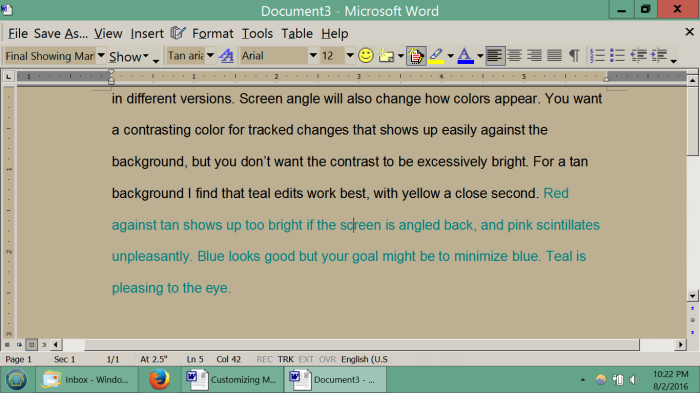

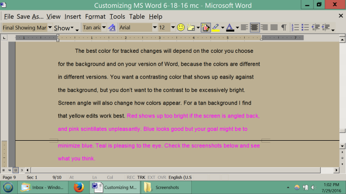
The way you change the color of tracked changes is different in each version of MS Word. In Word 2013 click on Review → Tracking → Tracking again (small arrow in the lower left corner) → Advanced options.
How About Libre Office?
In years past Microsoft Office reigned supreme in word processing. Today you have at least one other good choice: Libre Office, the successor to the previous Open Office. Libre Office has full word-processing and formatting capabilities. It has most of the features of Microsoft Office and in some cases more. It is generally compatible with MS Office, so the two programs can share documents. It is mostly bug free and undergoes continuous testing and updating. The user interface is very intuitive and easy to learn. Best of all, Libre Office is free!
Libre Office has the ability to track changes, with one drawback: there is currently no way to make deletions appear in the margins, as you can do with Microsoft Word. Instead they appear crossed out in the text, as in the screen shot below. The more edits you make, the more visually chaotic the page becomes, especially if you delete whole sentences and paragraphs. This is the only drawback that I’ve found so far with Libre Office. Additions appear in color in the text, as with Microsoft Word.
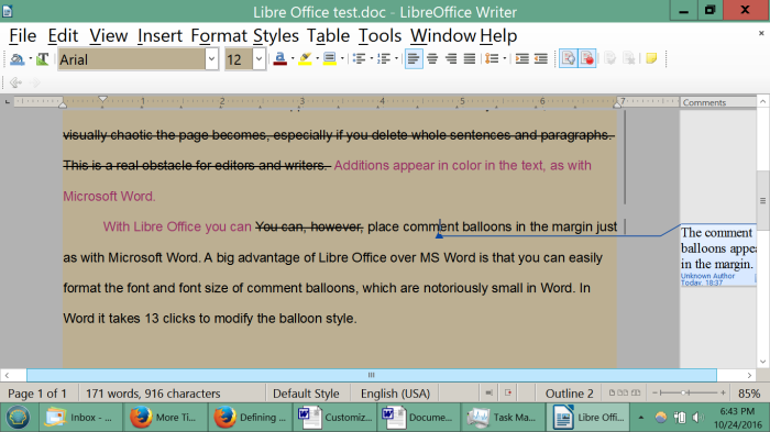
With Libre Office you can place comment balloons in the margin just as with Microsoft Word. A big advantage of Libre Office over MS Word is that you can easily format the font and font size of comment balloons, which are notoriously tiny in Word and require 13 mouse clicks to modify.
For people who have vision problems, a strong feature of Libre Office is the very simple layout of the menus at the top of the page, as you can see in the screen shot below. It has a simple scaling feature to increase the size of icons and the font size of menu items, set at 125% in the screen shot.

You can change the text background of Libre Office to any standard or customized RGB color you wish. In the screen shot the text background is my custom color, tan, on gray margins––the same as Microsoft Word.
Screen Brightness
The right screen brightness depends first on your MS Word background color. When I was using a white background I simply couldn’t tolerate its harshness and I turned the screen brightness way down. But that also meant a loss of contrast as the whole page became too dark. With a tan background I’m able to increase the brightness, which increases the contrast.
Blue Light
There is growing evidence linking excessive exposure to blue light emitted by electronic devices to Computer Vision Syndrome and macular degeneration [Ultra-violet and Blue Light Aggravate Macular Degeneration, Age-Related Maculopathy and the Impact of Blue Light Hazard (2006)]. Macular degeneration is not reversible and the threat of blue light to the eyes should be taken seriously by all writers and editors. I’ve done three things to protect myself from blue light: I got computer glasses with a coating that reduces the amount of blue light passing through the lens and I changed the page color to tan and installed f.lux to reduce the amount of blue light emitted by the screen.
You may find that as you turn down the color temperature in f.lux in order to reduce blue light, the screen becomes darker and you have to turn up the screen brightness to compensate. One way to resolve this is to create two themes, for using with and without f.lux. You could choose a lighter page color for use with f.lux to compensate for the darker screen. If all other settings are the same, you should be able to switch back and forth between the two themes with one simple click on the Personalization page.
If you use f.lux to reduce blue light, experiment to find the right balance between your screen brightness control and the color temperature in f.lux. I have my f.lux set at 4300K day and night. It takes some time for your eyes to adjust to f.lux. The color may feel odd to you in the beginning but your eyes should adapt to the change. See more tips for using f.lux.
Changing Your Computer and Your Environment Is Not Enough
Writers, editors, and others who do intensive word processing are at risk of developing Computer Vision Syndrome or permanent eye damage. There are many things you can do to take control of your working conditions and lessen these risks. In my home office I moved my work station to face a wall and installed shades. I placed a lamp above me and pointing upward. I modified my Windows theme to get rid of the stark white background of MS Word, my email program, and menus. I got new glasses with the right prescription and lenses that limit blue light and installed f.lux. With all of those strategies combined I experienced a very significant improvement in my blurred vision, dry eyes, and headaches.
But look again at the list of 12 things that impact your eye comfort (and it’s only a partial list) at the beginning of this article. If you really want to reduce your eye strain and light sensitivity, it’s not enough to make hardware, software, and environmental changes if that means you’re spending even more time on your laptop. A higher tolerance for longer hours at electronic work and play doesn’t mean your eyes are out of danger.
In the end what most of us need is a profound change in how we’re living. We need to get away from our screens and out into the natural green world. In fact several studies have shown that children who spend more time outdoors have less myopia.[3] We need to greatly increase our physical activity and engage in a wide variety of activities that challenge our body and mind in different ways, and use our eyes for distance vision outdoors to give them a rest from intensive close-up work.
We have allowed our personal world to collapse into a very small focal point of about one square foot in front of us, the size of a laptop. Computers were intended to expand our personal experience to a global scale. Paradoxically, many of us find ourselves spending almost all of our time in a very small box that constricts our attention and our movement, and our eyes and the rest of our body are worse off for it.
So change your Windows theme and optimize your word processing program to reduce glare and eye strain, but also close your laptop, get out of your chair, and expand your attention and activities to the rest of the world around you.
Margaret Copeley is a New Hampshire writer and editor.
Ps: If you find this post Increasing Eye Comfort for Writers, Editors, and Others Who Work in Intensive Text Environments useful, please consider LIKING, REBLOGGING, and/or SHARING it below.




Many years ago, back the days of DOS, I had Toolworks Office Manager suite. (I miss it greatly !)
As I recall, on-screen paper and borders could be any of 8 colours, text could be any of 16 colours.
Simply putting paper colour to cyan was very restful to the eyes.
Black paper with green text was also good. (Ring any bells ?)
LikeLike
Update from the author of this article:
I would like to update the suggested background color to medium gray, RGB 148 148 148, with black text. I’ve been using this for a couple of years and find it preferable to the tan I originally suggested, both for the appearance and eye comfort.
LikeLike
Wow, this was hugely helpful to me. I implemented your suggestions, and my eyes are MUCH happier. Thank you so much!
LikeLike
Happy to hear that!
LikeLike
I have tried some dark backgounds as an alternative to the dark gray. I’ve found that the dark purple and dark navy blue are acceptable under green or orange text. However, as stated in the article, we should avoid the blue light. Looking at the RGB content of those colours, they appear as R00G00B51 for dark blue, R25G00B51 for the dark purple and R00G25B51 for the dark navy blue. Comparing to light backgrounds, the ammount of blue is low (a light green is R153G255B153, for exemple). However, while in light backgrounds the blue proportion is mixed with other colors, as it happens with the the dark gray (RGB 646464), in dark purple and navy blue there are almost only blue light. Can anyone tell me if it’s ok to use those dark blue and purple as background? Thanks
LikeLike
Renato, hi and thanks for your comment/question.
I haven’t seen any scientific reports on this. So this is just my opinion.
You are probably right in your thinking. Your total exposure to blue light with dark purple or navy blue backgrounds is lower than that with lighter backgrounds with high blue component but mixed with red and green.
One thing is what your eyes are telling you.
The trouble is that often negative effects of blue light exposure may take a while to develop. So it is very hard to link the cause and effect.
I don’t feel this was particularly helpful. Sorry.
LikeLike
Very well written..Appreciate the effort you have put in to share this Information..I know when things gets messier especially when it comes to eyes we frantically search all the web to find a solution for it…you have put everything in detail and in lucid style..thanks for sharing…
LikeLike
Atlantis Word Processor supports dark themes of the entire GUI, plus it has the spotlight mode to let writers focus on the current document fragment:
https://www.atlantiswordprocessor.com/en
https://www.atlantiswordprocessor.com/en/help/spotlight.htm
Thought you might be interested,
LikeLike
The author of this article, Margaret Copeley, has asked me reply to your comment:
LikeLike
Thanks for replying, Uroš.
You are right. There are many requests for these important features on the forum of Atlantis Word Processor. According to the forum admin, the comments feature “is at the top of the to do list”. No date provided though.
LikeLike
Thanks for an informative and useful page. I’ve been googling for scientific tests on relaxing colours, but as usual, google very quickly returns non-search-specific results, except for your page. I’ve a Mac and use System Preferences/Desktop & Screensaver/Custom Colour/RGB Sliders then have been trying these colour values, including your Tan, which I sampled with Digital Colour Meter. Simply copy & paste the values into the textbox.
Linus Torvalds D5DFB7
Fractal green 699056
Relax green E7E3BF
Plan9 Acme FFFEEC
SoftLightGreen CEECCF
Beigey F6EAD9
Tan BBB097
LikeLike
Ranulph, thanks 🙂
LikeLike